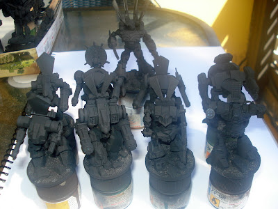
Hi guys, here are the mechs ready for painting, I need some advice on the paint scheme for my Japanese Merc Battalion, please vote for either of these ideas, I was thinking of going with No. 1 but am now leaning to No. 2.
1) each mech in a different bright colour, Light blue, pink, yellow, red, blue etc, each having a different Japanese theme, with a free hand mural Geisha, rising sun, Dragon, Cherry blossom, Koi, etc.
2) Each mech has the same 3 tone camo, but a different trim colour, Light blue, pink, yellow, red, blue etc, each having a different Japanese theme, with a free hand mural, Giesha, rising sun, Dragon, Cherry blossom, Koi, etc.
3) Each Mech has the same single neutral colour, but a different trim colour, Light blue, pink, yellow, red, blue etc, each having a different Japanese theme, with a free hand mural, Geisha, rising sun, Dragon, Cherry blossom, Koi, etc.
I will write up a background for this Battalion later, I'm now considering painting up a pilot for each of these.
Th group

The Shoguns mech
This APC is for a different force, but thought I would show the final configuration.


I'm kind of partial to scheme #3, but scheme #2 would look good too.
ReplyDeleteOption 3, definitely!
ReplyDelete-Chris K.
Go with 3. It makes the most sense.
ReplyDeleteReally like the Shogun's Mecha. Is that one a ZOD as well?
No. 3. I imagine your mechs doing that thing all mechs do in anime, they rush towards the edge of the screen but right before they cross out of view they come to complete stop slamming their combat arms into position making that awful stock clacking noise, form into a staggered line, then sharp half cut to eyes of the pilot going all squinty before firing a metric ton of bullets at what ever they are trying to kill. SUPER ULTRA MEGA ROBO-BATTLE TIME!
ReplyDeletego for the urban dazzle am I think
ReplyDeletecheers
matt
I personally wouldn't attempt to mix the ornate freehand murals with camo, sounds like a world of hurt. In fact I'd avoid camo on an anime themed scheme.
ReplyDeleteI'd go for 3 and let the main color of the freehand art match the trim.
I think number three, since it sounds more "anime" to have a light gray color, and then go nuts with the banner and nose art.
ReplyDeleteAfter all, not too much stealth in a camoed 30ft tall walker.
Thanks for the help guys, I will go No. 3, maybe a light gray, and keep the murals to nose art on most.
ReplyDeleteIf you don't want to free-hand the art, there is always decals!
ReplyDeletehttp://www.fightingpirannhagraphics.com/
Really diggin' the aerials on the shogun's suit. Like the others, I'd say No. 3 is the way to fly.
ReplyDeleteAdditionally, the Mecha Profiles site (http://mahq.net/mecha/gundam/)has a lot of colour schemes and such if you're still unsure on how to proceed.
It's terribly off-topic, but I've tagged you and your blog for a blog-chain I'm participating in. Fairly harmless, and it's quite alright if you choose not to participate. Below's just the run-down, and my part is, of course, on my blog.
The Rules Are:
1. You must post the rules.
2. Post eleven fun facts about yourself on the blog post.
3. Answer the questions the tagger set for you in their post, and then create eleven new questions to ask the people you've tagged.
4. Tag eleven bloggers, however, you can break the rules and tag fewer people if you want. Make sure you hyperlink their names/blogs.
5. Let them know you've tagged them!
6. Have fun!
Looking forward to your response, either way.
Cheers!
Wild looking...I'd go with no.3
ReplyDeletehttp://generalwildescivilwarinminiature.blogspot.com/